Common Mistakes to Avoid in Kerning Your Typography
Typography can make or break a design. Kerning, which is the adjustment of space between characters, is an essential aspect of typography. Kerning can make the text more readable and visually appealing. However, if not done correctly, kerning can ruin the entire design. In this article, we will discuss the common mistakes to avoid in kerning your typography.

Not Paying Attention to Font Choice
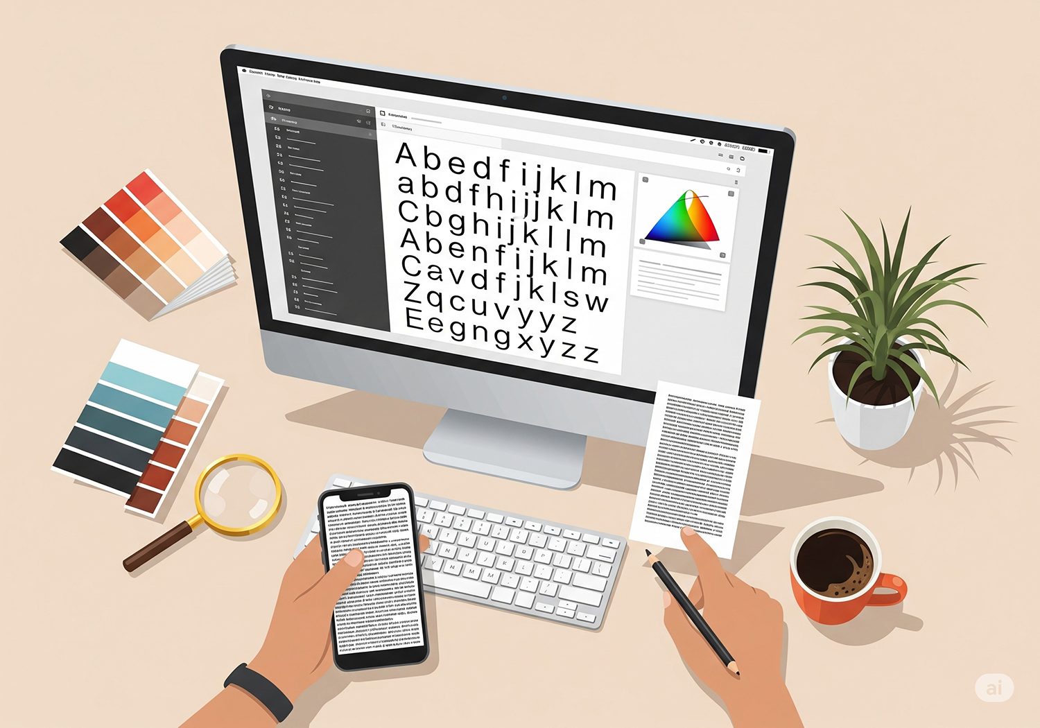
The font you choose plays a significant role in determining the kerning. Serif fonts typically require more space between characters, while sans-serif fonts require less space. Before kerning, choosing the right font for your design is important.

Over-Kerning or Under-Kerning
Over-kerning and under-kerning are common mistakes that designers make. Over-kerning occurs when there is too much space between characters, making the text look too spread apart. Under-kerning, on the other hand, occurs when there is not enough space between characters, making the text look cramped. It’s essential to find a balance between the two to create a visually appealing design.

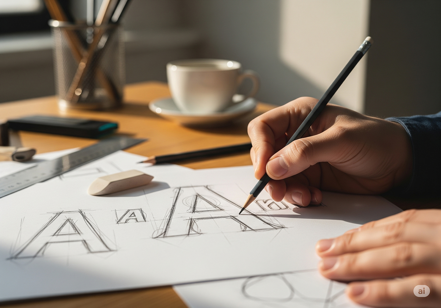
Ignoring Kerning Pairs
Some characters in a font require more space when paired with certain characters. For example, the letter “T” needs more space when paired with the letter “A.” These are called kerning pairs. It’s important to pay attention to these pairs and adjust the kerning accordingly. A quick Google search can give you a list of common kerning pairs to keep in mind.

Not Considering the Viewing Distance
The viewing distance can affect how the kerning looks. Kerning that looks great on a computer screen may look too tight or too loose when printed or viewed from a distance. It’s important to consider the viewing distance when kerning your typography to ensure it looks great at any distance.

Relying Too Much on Kerning
Kerning is an essential aspect of typography, but it’s not the only aspect. Relying too much on kerning can cause you to overlook other crucial elements of design. It’s important to consider other aspects such as font choice, line spacing, and font size to create a well-balanced design.