Boost Your Website's Impact: Master Typography for Effective Calls-to-Action
To drive conversions on your site, you need a great call-to-action (CTA). But even the best copy can fail if it doesn’t grab attention. That’s where typography comes in. By using the right fonts, sizes, and styles, you can create CTAs that get clicks. In this post, we’ll show you how to use typography to create powerful CTAs that drive conversions. Let’s get started and turn your CTAs into conversion machines!

What is a Call-to-Action?
A call-to-action, or CTA, is a marketing tool that encourages people to do something specific. It could be to click a link, sign up for a newsletter, or buy something. A CTA prompts people to respond in the way the marketer wants.
CTAs can be different types, like text links, buttons, or plain text without links. Simple CTAs are things like “Buy Now” or “Download Now”. But a CTA can also be longer and more descriptive, like “Subscribe today so you don’t miss any posts.”
A good CTA can reduce confusion and guide people. It can also create urgency and increase sales. Without a clear CTA, customers might leave without doing anything, which is bad for business.
To make a good CTA, think about what you want people to do and who they are. Here are some tips:
- Use strong words like “buy” or “subscribe”
- Make it urgent with phrases like “limited time offer”
- Keep it simple and avoid fancy words
- Make sure it stands out with bold colors or text
A good CTA can help you get what you want from people. Use these tips to encourage them to take action.

Why Call-to-Action Design Matters
CTA design is super important for websites. CTAs turn visitors into customers, so make them look good. A good CTA leads visitors to do what you want, like signing up or buying something. Here’s why CTA design matters:
- CTAs get people to act. Make a good CTA and visitors will follow it.
- CTAs help visitors get involved. An easy-to-understand CTA gets more attention and makes visitors interact with your website.
- CTAs tell people what to do. Without a good CTA, visitors might not know what to do next. A CTA guides them to the right place.
- CTAs make people feel like they need to do something right away. A great CTA creates urgency.
- CTAs help you figure out what works. Tracking CTA clicks shows you how well your website and marketing are doing.
In short, make your CTAs look good. They’ll help you get more customers, keep them around, and figure out what’s working.

Call-to-Action Design Tips
When creating your website, your call-to-action (CTA) buttons are a must-have for guiding users towards your goal conversion. CTAs are buttons that users need to click to take the action you want them to take. The right CTA can make a huge impact on your website’s success. Here are six CTA design tips to help you create powerful calls to action:
- Color matters. Choose colors that match your branding and contrast with the background. Bright colors like green and orange perform best.
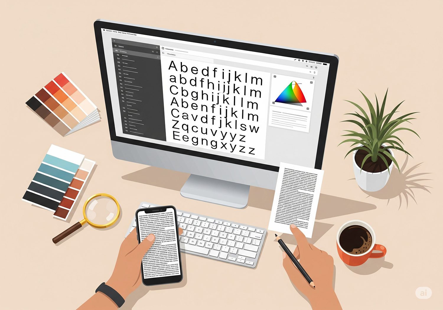
- Typography matters. Use fonts that match your branding and are easy to read on digital screens. Bold and italic fonts can make your text stand out.
- Use contrasting colors and fonts. This can help draw attention to your CTA buttons and increase conversions.
- Keep it simple. Avoid using too many colors, fonts, or images. Simplicity can help your CTA buttons stand out and make it clear what action you want users to take.
- Use white space. This area between design elements can make your CTA buttons stand out and your design look more visually appealing.
- Test and optimize. Run A/B tests to see what CTA design performs best. Test different colors, fonts, and button sizes to improve your website’s performance.

Conclusion
Typography is super important for making your website’s calls-to-action (CTAs) work better. To do it right, just focus on the design and pick the right fonts, colors, and sizes. When you choose the right font, it helps people read your CTA better and makes it look good too. Bold and easy-to-read fonts are perfect, and bigger fonts catch people’s attention more.
Colors matter, too. Use color psychology to pick a color that makes people feel the way you want them to. And don’t forget to make sure the color of the text and the background are different enough so the CTA stands out.
So, if you want your CTAs to get more clicks and help your website’s conversion rates, just remember to pick the right font, color, and size.